
Code and Coordinates
engineering at Geocodio
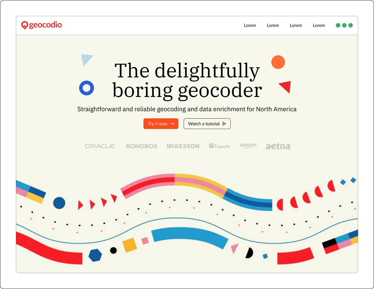
Delightfully Boring, Carefully Crafted: The Story Behind Geocodio’s Redesign
How Geocodio got a visual identity and a voice
By Kimberlee Keene
I joined Geocodio in November, right as the website redesign was entering its final stretch. I got to watch the last pieces come together without having lived through the messy middle. So I went back and talked to the people who did.
This is the story of how Geocodio got a visual identity and a voice. All it took was two designers, a copywriter, a team of developers, approximately 12 (14?) shades of button color, and one design brief that referenced, somewhat paradoxically, both a children's TV show and modern art.
We didn’t have a designer, and it showed
Mathias and Michele, Geocodio's co-founders, have always cared deeply about user experience. The product itself, the geocoding engine, was thoughtful. Ease of use for developers and spreadsheet users alike had been a priority from the start. When I joined the team, one of the first things that struck me was how happy customers were. People said “it just works,” and our NPS score of 88 backed that up. For a marketer coming in fresh, that’s a pretty great starting point.
The visual design was a different story.
Neither Mathias nor Michele is a designer, and in their words, “it showed.” The original Geocodio site was a Bootstrap template. It was, as Michele describes it, “horrific,” with a neon color scheme and a logo that inexplicably had a cowboy hat. (Okay, there was an explanation: “Geocodio: rhymes with rodeo.” Still…?)
When I started, Michele showed me some of the iterations of the website over the years. 👀 Luckily, during my interview process, I’d learned that a full redesign was already underway. I had done my best to play down my excitement (or relief?).
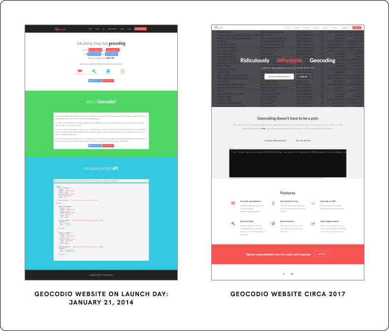
It received a few updates over the years…
At one point Michele got sick of the red banners (neither founder could explain how they'd ended up with so much red in the first place). So Michele tried to introduce teal, because a color palette tool said it was complementary to red. She later asked a designer friend what they thought. Their assessment: Sorry, no.
And the gap wasn't just visual. The copy was informative, but there was no voice, no personality, no point of view.
“Mathias and I looked at each other one day,” recalled Michele, “and sort of said, ‘We like to think we aren’t dull or humorless people, and that isn’t the way we run our company, so why do we have a site and copy that are so aggressively bland?’ It didn’t communicate any of the warmth and enthusiasm we feel for our customers, our team, and what we do.”
The Brief: Three Words, a Children's TV Show, and an Elementary School Teacher
The brief took shape around a long-standing graphic idea that Mathias had: Geocodio represented as a magical machine where messy addresses go in and clean data comes out. This idea reminded Michele of the educational children's TV show StoryBots, with its whimsical factory aesthetic. That reference went into the brief.
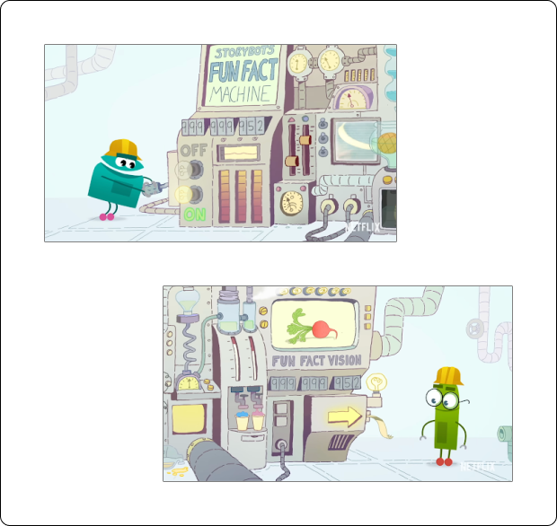
(Chris, the motion designer, reportedly questioned whether he was the right person for this after seeing that particular reference.)
Michele and Mathias looked at other SaaS websites for inspiration and quickly hit a wall. Most SaaS landing pages lean on UI screenshots and product illustrations. But Geocodio’s product is data via API response and spreadsheet download. There's no product UI to show off. And while Geocodio includes maps with spreadsheet uploads, the focus is location data for analytics purposes, not cartography.
“There are companies out there whose sole focus is to help people create beautiful maps,” said Michele. “Our niche in the market is more in data analytics, and we didn’t want to lean heavily on map references and accidentally mislead people.” The site needed to speak to geography without using maps.
One site they came across had a grid pattern background that reminded them of the coordinate grid. It immediately clicked: geographic without being literal. Geographic meets geometric.
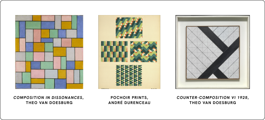
Michele fell down a rabbit hole of geometric modern art from the 1920s and 30s. Think: Theo van Doesburg. De Stijl. Very geometric paintings that took "geo" in a completely different direction. She particularly liked the idea of mosaics as bringing lots of disparate data points together into one coherent output.
And alongside it, a personality instruction to think of the brand like an elementary school teacher: respectable, knowledgeable, trustworthy, approachable.
That instruction, as it turned out, scared the design team a little. (To be fair, I think I’d be scared, too.)
But before we get into that, let’s introduce them.
First Impressions (or: Wait, what’s geocoding?)
Michele found Jess Lau, the visual designer of Geocodio's new site, through a founder friend who had worked with her in London. That recommendation was enough.
Michele’s brief landed differently than most corporate projects. The hard requirements were refreshingly few: no red, magical address machine, geometric vibe, personality.
"Corporate projects usually have a cap on how creative you can be. It's kind of like, have fun, but don't have too much fun," she said. "But this one was kind of like gates are open, run free."
The idea about a magical address machine made Jess know she needed to bring on a motion designer from the start, and she knew just who to call: Chris Sellars-Meadmore, a motion designer and close collaborator for many years. Jess and Chris went to university together, and Jess said that the level of freedom made it almost feel like a student project.
"I was designing with motion in mind from the very beginning," Jess recalled. "Often it comes in towards the end of a project, with something like, oh, how do we do this hover state? But with this one, we always knew it was going to be moving."
Jess took on the project genuinely not knowing what geocoding was. She had to discover it from scratch, reading through hundreds of pages of technical content. And then there was the added layer of it all being specific to North American addresses, which, as a UK-based designer, had its own learning curve around ZIP codes and Congressional districts.
"I would be sat there reading documentation, figuring out how everything works, and then relaying it back to Chris," Jess said.
But not knowing turned out to be a UX superpower rather than a liability.
"If I have to discover something, it means that I then know how to package it for someone who doesn't know what it is, because I've had to go through all of the learnings," Jess said.
Starting from Scratch
When the designers presented the first mood board concepts, they framed the whole project in a way that stuck: this refresh was about bringing the visual identity up to the standard of the product. Not a reinvention. A considered evolution.
They also latched onto something Michele said on their first call, almost offhandedly: complex idea goes in, simple result comes out. She'd meant it as a description of what Geocodio does. But it sparked an idea for the designers, and they heard it as a visual principle. It became a design throughline for how shapes would move, how information would flow across the page, and how everything would tie back to what Geocodio actually does.
They laid out a clear test for every design decision that followed: when someone lands on the site, they should feel two things. Can I trust this? And can I use this?
Early Concepts
The fundamental challenge Jess and Chris faced was one of exactly what to visualize. There weren’t many product visuals to pull from. And beyond that, geocoding is pretty invisible, and only one step in a much larger process. How do you visually convey a technically-complex data transformation process that, in the best-case scenario, occurs in the background unnoticed?
Early concepts went too literal. Bold lines, solid colors, almost an 80s video game feel. Playful, but still too on-the-nose.
"With the early mockups, we kept going back to something techie," Jess said. "We couldn't move away from illustrating something that was literal."
Two early concepts reflected that literal inclination. One leaned on simplified UI illustrations, similar to what Figma and Miro have done with their brands. Another was heavily illustrative and more typical of SaaS websites.
The second option almost didn't make it into the deck. The designers kept taking it out and putting it back in. Ultimately they included it, but with a caveat: it felt like it was missing the humor and light-heartedness of the copywriting drafts. The visuals needed to match the personality the words were creating.
That observation mattered, and not just for the mood board. It set a precedent for the rest of the project: the design would be accountable to the voice, not just to aesthetics. And the voice, as it developed, would push the design further than anyone expected.
The Breakthrough
The breakthrough came from subtraction, not addition. Scrap the idea of product illustrations entirely. Go more conceptual. Simpler shapes, more line work.
Jess and Chris ended up presenting three directions: the two mentioned previously, and another, riskier, more conceptual direction, with geometric shapes and line work representing data flow.
"I think that's when it started to come together, a stronger way to try and explain something that is really quite complex," Jess said.
As soon as Michele got mood boards back from Jess and Chris and saw the abstract direction, she was blown away.
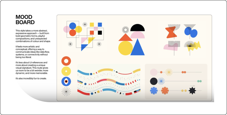
“I was so thrilled,” she says. “It was so fun. So different. I immediately saw how the flowing lines represented flows of data, and loved how they made that association.”
Secretly, the abstract direction was Chris and Jess’s favorite, too.
And then something unusual happened: Michele kept pushing them to go further. "There were times when Chris and I were like, Michele wants more? Really?,” Jess recalled. “Normally it's more, tone it down, bring it back. You never get a client saying more.”
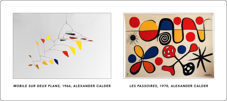
But Michele loved it. It reminded her of Alexander Calder: the geometric shapes in different colors, the sense of motion, the playfulness with balance. It reminded her of a Calder exhibition she'd seen at the Whitney in 2017, when she and Mathias went to New York to speak at Laracon about Geocodio’s founding story. That connection solidified it as the direction to go in.
More than that, it was different. It didn’t look like any other SaaS websites, especially not ones in the geospatial industry, and that was a huge plus.
It was also fun. “We’re in a very competitive space, and I wanted a site that would stand out in peoples’ minds. Some people might only need geocoding once a year, so there’s a real value in being memorable. I also wanted to bring a little bit of humor, a little bit of lightness, to what might be an otherwise humdrum part of their day,” said Michele.
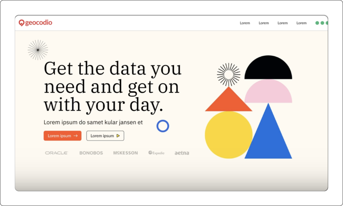
The vision for the site was starting to come together: abstract but tangible. They could abstractly represent the concept of location data and rather than creating illustrations of the product, just let people try it for themselves with code examples and demo tools.
Finding the Voice
Michele sent those mood boards straight to Lianna Patch, the copywriter she'd brought on in parallel.
Michele had hired Lianna because they needed someone who would push them to find a voice as well as to think about the site from a conversion perspective. The existing copy was functional. It answered customer questions and hit SEO keywords, but had, in Michele's words, "a painful lack of personality."
It also didn’t speak to any of the emotional or social jobs that Michele had uncovered in her years of customer interviews. “I have a bit of a mental block around creative copywriting, and really struggled to translate that understanding into marketing copy,” she admitted.
Michele knew Lianna would change that.
“And also, she’s just really fun to work with,” added Michele.
Lianna's process started with research, reading through a decade’s worth of customer interviews.
And through that research, she discovered that people choose Geocodio for two reasons that sound like they shouldn't go together.
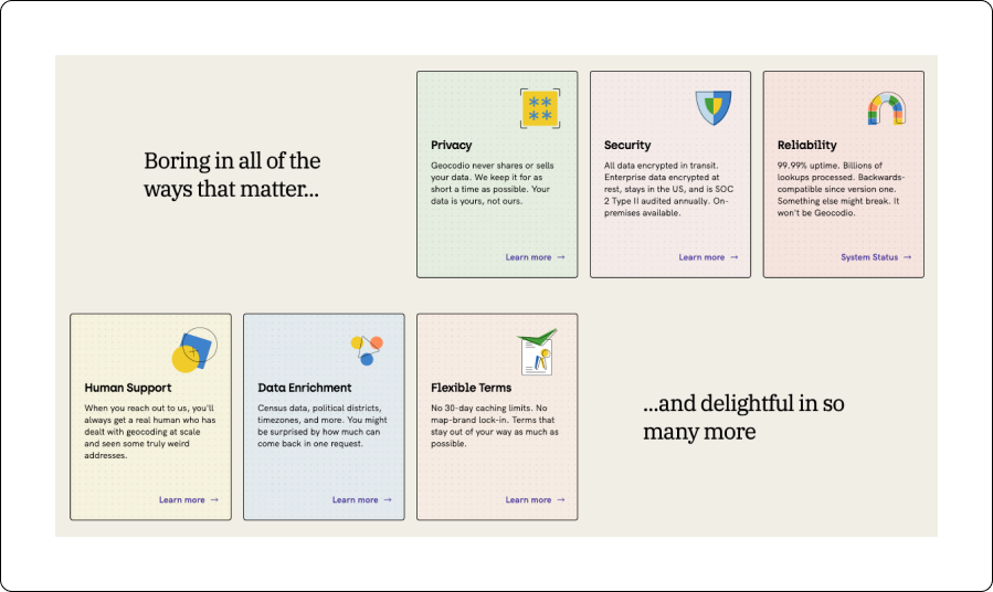
First, it’s boring: reliable, stable, and still supporting the first API version ever released.
“From the customer interviews, it was clear customers value how reliable Geocodio is,” said Lianna. People don’t want their geocoder to be exciting, they want it to fade into the background and be able to forget about it. “But when something is incredibly reliable, it becomes boring,” she added. When describing Geocodio, people would say “it just works” with a kind of shrug.
Yet at the same time, Geocodio is delightful. "There were consistently little moments of surprise from customers when they realized they could add additional data or store the results, or with how quickly results came back," she added.
Boring and delightful, at the same time.
"Humor often lives in the unexpected juxtaposition between two extremes,” said Lianna. “So there's this really fun contradiction in the idea of proudly making something as boring and unexciting as possible,” she continued. “Boring becomes a point of pride!"
From that insight, Lianna came back with homepage headline options. One of them was Delightfully boring geocoding.
Michele saw it on the Google Doc and went running to find Mathias, because that was it.
Here's the thing about that headline: when Michele was later working on smaller landing pages with Claude, it told her that a brand would never describe itself as "boring," let alone "delightfully boring." Claude admitted that it would never think to suggest that as a tagline: too self-deprecating, too weird, too human.
But every customer we’ve shared it with so far has loved it. Only a human, put on a project with a relatively open brief and a treasure trove of customer research, would come up with something that out there. But Lianna knew from reading all of those customer interviews that “boring” is the highest compliment Geocodio's customers pay it, even if they never use that word directly. That insight was a creative leap that only a human could make.
Michele asked Chris and Jess to mock it up. One look and it was locked in.
The "elementary school teacher" personality note from the original brief was evolving into something more fun than anyone had originally expected. Not quite Ms. Frizzle, but perhaps a quirky art teacher who also knows their way around a 3D printer.
“I wanted a site that was more pleasant to look at just as a baseline, but what I really wanted was a site that was a little bit different,” explained Michele, “because it’s fundamental to who we are as a company to do things differently, friendlier, than others: from our flexible terms of service that permit data storage to how our customer support is provided only by humans. We wanted a site that reflected how we’re different in a good way, and somehow, these three amazingly talented humans—Jess, Chris, and Lianna—found the heart of that and brought it to life.”
We should note that Michele ended up mucking around with a lot of the copy (she refers to herself as “probably the worst client ever, okay, maybe second-worst because I did pay my bills promptly”), so if you see any copy kicking around that doesn’t land, don’t blame Lianna. But that headline? The strategic direction for the copy? The SEO and conversion-optimized page structure? The definition of the voice? That was all Lianna, “and I never would have gotten there without her,” says Michele.
(Somewhere in all of those co-writing sessions, things got very weird. After far too many hours of writing and re-writing copy, Michele and Lianna started writing poems about geocoding as a creative outlet. Limericks. Haikus. Sonnets. Some of the best [worst?] ones are sprinkled on the login page.)
The Design Comes Together
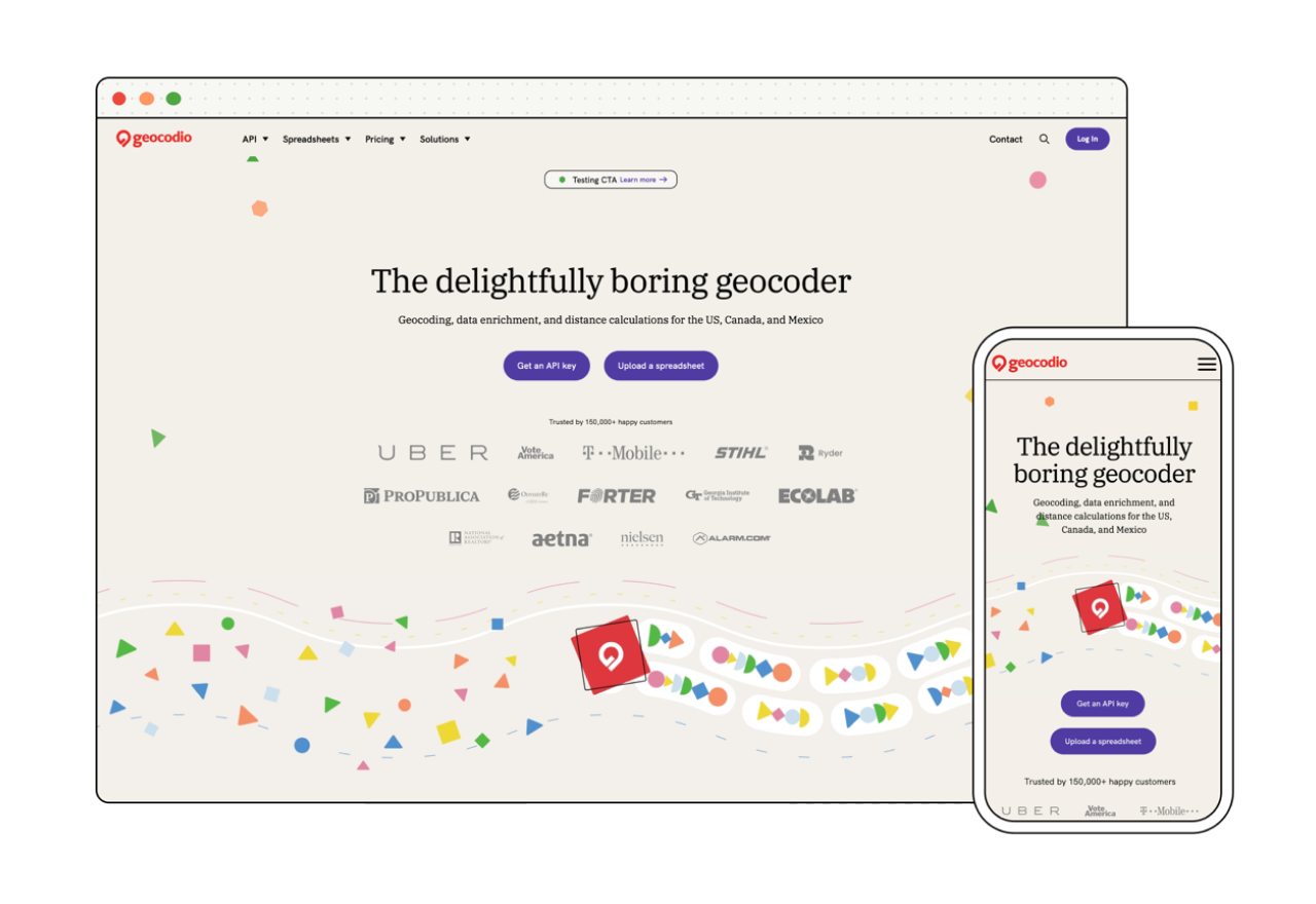
That headline changed everything. The juxtaposition of boring and delightful gave the design permission to go further, and led to a design that “straddles polar opposites” in Jess’s words: super abstract with the shapes, super literal with the interactive tools where people can enter an address and try the product. No middle ground.
And it gave the whole project a vibe that had been missing. It made Geocodio’s personality concrete.
Motion from day one. Unlike many projects where animation is an afterthought, this one was built around motion from the very beginning.
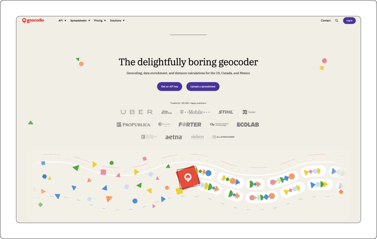
Everything started with “the machine.”
Early iterations were more like wavy lines, almost like a river (“data feeds became data flows became a river,” said Michele).
Shapes, representing parts of addresses, are vacuumed up by the geocoding machine and come out nice and neat and organized on a conveyor belt.
“We have people tell us all the time that the raw addresses they’re working with look like they were typed by half-asleep monkeys, and it’s a nightmare for them,” says Michele. “The machine was such a brilliant intersection of Lianna’s insights about our customers and Chris and Jess’s design skills: the machine represents the fundamental job we’re doing for customers of turning messy into organized. Chaos to calm.”
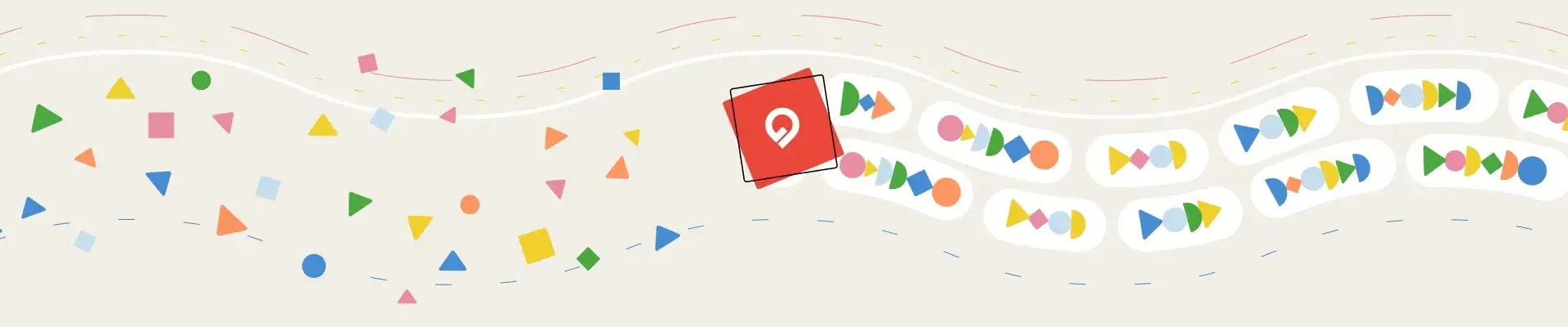
The confetti. Shapes then became the visual language. Abstract enough to avoid being literal, but purposeful. Each shape and movement represents the sorting, organizing, and standardizing of address data that Geocodio does.
The shapes were never meant to become the signature brand element, but they became incredibly versatile for telling the story and conveying what Geocodio does.
"It was just a natural evolution of trying this and taking that,” Jess said, “And that's how it became the constant thread that was kind of holding the whole design system together."
The shape confetti was originally only in the footer, but Michele wanted more. Now, the shapes ever-so-slightly chaotically drift around the page, waiting to be vacuumed up.
It may not have been part of the early drafts, but the confetti is maybe the Geocodio team’s favorite part of the new branding.
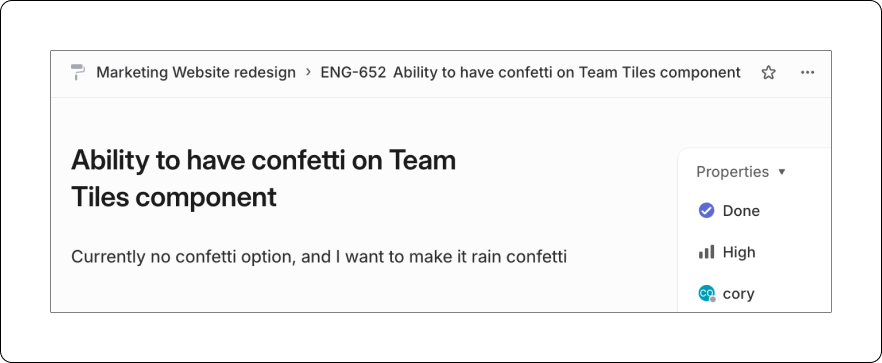
During implementation, we even had a real Linear issue for a real engineer that said "make it rain confetti." (Now is probably not a good time to mention that we’re hiring engineers.)
There’s even been casual talk of having a confetti booth at a conference someday. Please send help, we’re out of control!
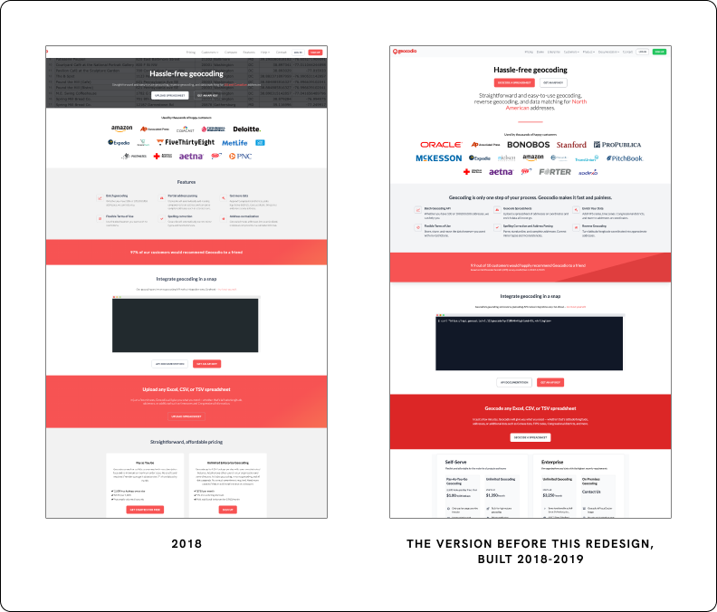
The color debacle. Everyone found easy alignment on “the machine” and the shapes, but colors were a different story.
Michele’s one firm requirement on colors was “no red.” She came around to allowing the logo to remain in red (it also made sense for practical reasons, as we have a lot of red Geocodio socks and stickers), but drew the line there.
CTA buttons drove the color scheme, and initial concepts were more muted.
But Michele kept pushing them to go further: more vibrant, more saturated. That proved to be a bit of a challenge.
All told, 14 very different options were considered. Neon green, light yellow, orange.
Eventually: a nice purple, a far bolder color than Jess would have anticipated.
Modern art, meet modern web design. Remember the De Stijl paintings and Art Deco pochoir prints in the brief?
The coordinate grid idea evolved into a dot grid pattern, subtle enough to feel like texture, specific enough to evoke address points. It's woven through elements across the site.
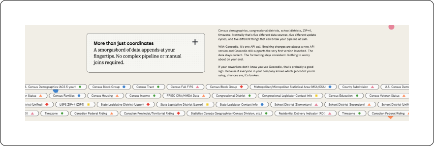
And the mosaic idea ended up solving one of the project's earliest challenges: how do you visually represent a product that outputs data, not interfaces? The scrolling grid of data enrichment options is the answer. Each tile is a different type of data Geocodio can append to an address, and together they do what a product screenshot would do for any other SaaS company: show you what you're getting.
When I first saw those elements, I didn’t think, "Oh, of course, 1920s Dutch paintings." That’s the trick of good adaptation: the inspiration is evident if you know it, but invisible if you don’t. It absorbs the reference without wearing it.
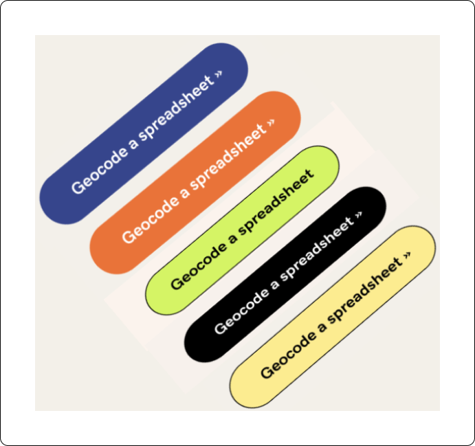
Rule-breaking typography. This didn’t start out as a weird project, but it inched there step-by-step. “Delightfully boring” led to shapes with their own personalities, kind of like Minions. Once the geometric shapes became playful, the writing had permission to be weirder. Cheekier. More surprising.
"I think the design influenced the copy perhaps just as much as the copy influenced the design," she said. "They became inseparable."
But the visuals and the copy together opened up room for the typography to break the rules. And once the copy voice found its confidence, Jess knew the typography needed to match the personality.
"It was important to not go for a standard interface sans-serif that feels like, ‘here's another SaaS platform,’" Jess said.
The font pairing she landed on combines two typefaces in a way that, by conventional rules, shouldn't work. If you'd told Jess at the start of the project it would be those two fonts, she would have said "’No, that absolutely does not work!’” But the visuals and the copy “called for it to be a bit more out there,” she added.
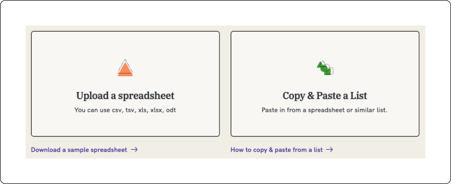
Putting the fun in functional design. That interplay between design and copy is also what made the spreadsheet upload flow work. A technical UX flow that has to be utterly clear and functional, where a user needs to go from A to B with no second-guessing. And Jess infused it with the same visual personality as the rest of the site.
"Being able to bring that fun element and visual identity into such a technical flow, but still maintain the integrity of the UX, was challenging and important," Jess said.
It's proof that a strong visual identity doesn't compromise usability. Fun and functional aren't opposites. Which, for a site whose whole brand is built on oxymorons, feels right.
Bringing it all together. The homepage is where the full expression of Geocodio’s personality comes together: motion, shapes, typography, copy. Jess called it "the crème de la crème of this project." It's where she and Chris went most all-out with motion design, and it's where the investment in designing with movement from day one pays off most visibly.
Building It
When Jess and Chris saw the first preview of the front-end build, they were genuinely impressed. The implementation was nearly pixel perfect. Sizing, spacing, template translation: all as designed. And this was before any design review or QA.
"Anything that is a bit off can really throw the look," Jess said. "The build looks exactly how Chris and I intended it."
The back-end work through Statamic added another layer. The admin system includes customizable content blocks and configurable floating shapes: how many appear on a given page, whether they move, in what direction. The team migrated hundreds of landing pages to the new format. And now the design system provides a foundation for emails, print content, event materials, and swag. A complete visual identity, built to grow.
“The fact that I can not only customize how many shapes appear behind a particular element but whether they animate and in what direction they move is just so delightful,” says Michele, using a word that has become a favorite around here. “Our developers put so much care and thought into not only making the site an enjoyable experience for our customers, but also for their team members, and that level of thoughtfulness says so much.”
Go have a look-see
We asked Jess what she wants people to feel when they land on the new site.
"Tech platforms can be fun," she said. "A tech platform or a dashboard doesn't have to have a really serious, boring interface. Having a playful visual identity doesn't mean you get any less of a good user experience. It can be delightful and functional."
And then: "It can be simple and complex. It's just a website of oxymorons."
"That’s a tension that only humans could have come up with and stuck the landing on," added Michele. "A lot of people are wondering these days whether it makes sense to hire designers and copywriters. This project is a bright, shining example of why you should do exactly that."
She continued, “I use Claude throughout the day, and am a proponent of it within the company. Yet AI requires you to already have a clear concept of what you want. It can pretty reliably copy something that already exists. But the challenge of this project was figuring out how to represent Geocodio: what we do, how our customers feel about it, and our niche in the market.”
“If I’d fed Claude a bunch of SaaS websites for inspiration, it never would have come up with framing the product as ‘delightfully boring’ and using geographic shapes to represent parts of addresses, never mind sprinkling them as confetti throughout the site. That is the kind of outside-the-box brilliance that can only come from talented people. And they exceeded my wildest dreams.”
Every shape, every font, every word on the site is there for a reason. Some of those reasons took 14 color swatches or hours of conversation to find. None of them could have been prompted into existence from scratch. The what of design is visible to anyone who visits the site. The why behind it is half of the challenge, and that part wouldn’t have coalesced without human intellect and creativity.
We're grateful to Jess, Chris, and Lianna for caring about this project as much as we do. For pouring through our docs. For reading heaps of customer interviews. For putting up with pickiness about button colors. For devoting their time and energy to this project for many months. If you're looking for a visual designer, a motion designer, or a copywriter, we can't recommend them enough.
Now go enjoy the confetti.
PS. There are a few little Easter Eggs that those of you who know our founders might spot. Let us know when you find them.
Get new posts in your inbox
We write about what we're working on, thinking about, and getting so excited playing around with that we accidentally stay up a bit too late.
Thanks for subscribing!